Tuesday, 8 January 2013
Camera Controls Exposure Apature, Shutter Speed & ISO

This picture shows the relationship between the apature and shutter speed. This is important as the right settings will give the the correct or desired exposure.
Apature - this is mesured in f/stops.
The smaller the number the bigger the opening, this lets more light into the lens.
The bigger the number the the smaller the opening, this lets less light into the lens.
Shutter Speed - this is the amount of time the shutter is open for.
The longer the shutter is open the more light is let in, this also causes the motion blur.
The faster the shutter speed the less light is let in, this creates a sharper picture.
You will need to balance these two settings to achieve the desired result.
Adding to this there is an ISO setting that helps with achieving the correct exposure.
This ISO is how sensitive the light sensor is to the light in the scene.
 The higher the number the more sensitive it will be. This can help add light to your picture however it has its down fall. The higher the number to more digital noise will appear in your image.
You will need to balance these two settings to achieve the desired result.
Adding to this there is an ISO setting that helps with achieving the correct exposure.
This ISO is how sensitive the light sensor is to the light in the scene.

Tuesday, 23 October 2012
Finished Motion Poster
 |
| Here is my fished poster... To achieve the zombie look I grey brushes, the burn tool (a lot) and textures that I overlaid on the face and used blending modes like overlay and soft light. I used the burn tool to darken and dirty up the face. For the text I used a scratched metal texture and I also added a shadow to the figure using a black soft brush and lowering the opacity of the layer. |
Here is the LINK to my finished motion poster. I split the image into a foreground image and a background image. Between them I added a rainfall effect in after effects.
Tuesday, 16 October 2012
Motion Poster
The dark knight rises motion poster has a foreground (batman), a background (the bat symbol) and a layer inbetween that is animated. This creates a 3D look.
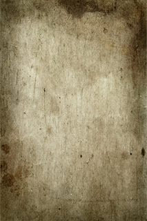 The foreground of my poster will be a zombie, the background will this image ---->
I want it to be darker at the bottom where the title 'RUN & HIDE' will be in white thick text with scratchy and blemished textures over it
 here are some of my ideas...

I want it to be darker at the bottom where the title 'RUN & HIDE' will be in white thick text with scratchy and blemished textures over it


Horror Photography

Kayleigh Ball has used a slow shutter speed to get a long exposure. This creates the scary look
 |
| there are a lot of different images over laid on this poster. there is a spooky sky, the derelict london city scape and the zombies and trapped people. the text and logo are scratched and messy like the surroundings |
 |
| this poster uses a spooky wood setting and back lit to create an outline of the figure |
| The scream poster uses the chin of the mask as a knife which is the murder weapon in the film. the text also has a knife like M |
 |
| the combination of the eye and the fingers adds a creepy look |
 |
| This poster use a dark surrounding to create a spooky face. the focus is on the eyes as they are wide and bright |
Tuesday, 9 October 2012


Subscribe to:
Posts (Atom)